Objective & Inspiration
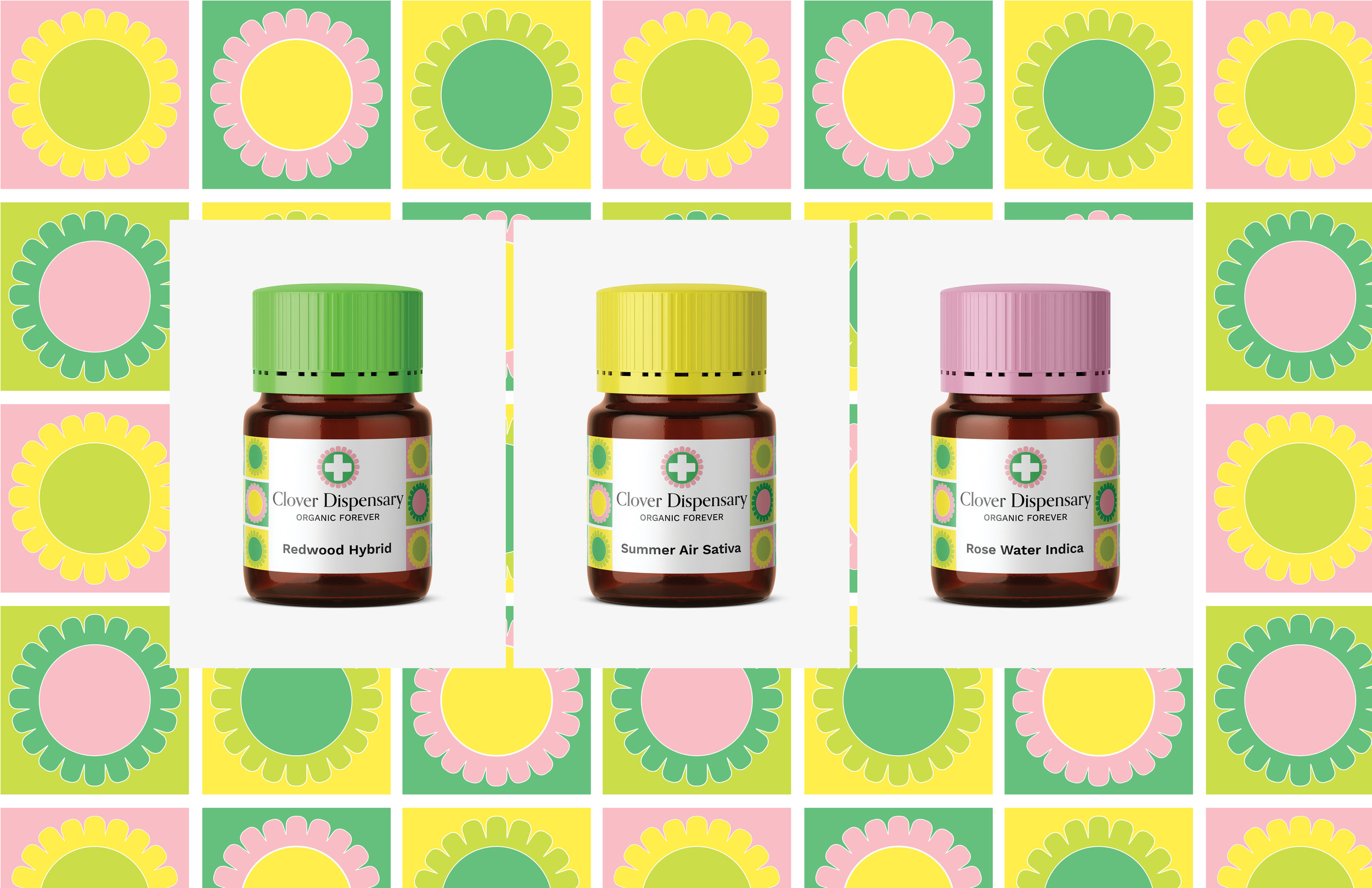
Objective: To design an identity for a cannabis dispensary that is welcoming, clean, friendly with a focus on health and wellness.
Inspiration: I was inspired to create this project by the immense possibility for industry that legal marijuana creates. After reading a recent article, I was stunned to learn that Colorado is set to receive $200 million in tax dollars from marijuana sales. Last year Denver received $27.5 million alone. I was inspired to design an identity for a dispensary that strayed away from the psychedelic, dark, trippy head-shops of yore and made patrons feel as though they were walking into a trendy juice bar or upscale cosmetics shop. No door-beads or black lights here, just a clean, friendly, bright environment.
(City Pages, Reefer Riches: What Minnesota could learn about recreational marijuana Susan Du)
Mood board, inspiration and research.
Particular focus on a simple spring color palette, playful illustrations, and minimalist cosmetics.

Logo and type ideation
I created a logo using the traditional medical cross (now frequently used for medical marijuana clinics) and added styled petals to symbolize the clover flower and give the logo a friendly impression.